Grids
The Grids section defines the columns in the grid(s) that are presented to the users who performs the workflow tasks.
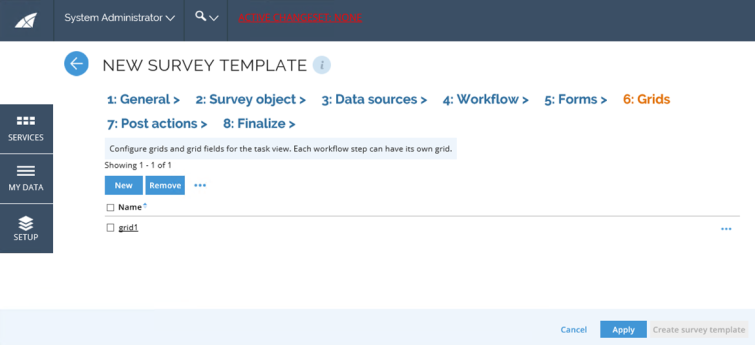
It is possible to define several grids, for example, if you want to use an alternative grid for the admin view, or different grids for the different workflow steps.
The bottom toolbar has options to add, edit, and remove grids. The grid has options to edit Fields, Preview, and Copy the grid.
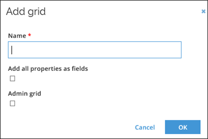
Create a new grid
Follow this steps to create a new grid:
-
Click the New icon to open the Add grid popup.
-
Give the new grid a name.
-
Tick the Add all properties as fields checkbox to add all properties on the survey objects as fields in the grid.
-
Tick the Admin grid checkbox if this grid will be used in the survey administration view.
-
If you are creating a parent/child survey, you can define which form is a child grid for the given grid.
-
Click OK to save the grid and be able to edit the fields.
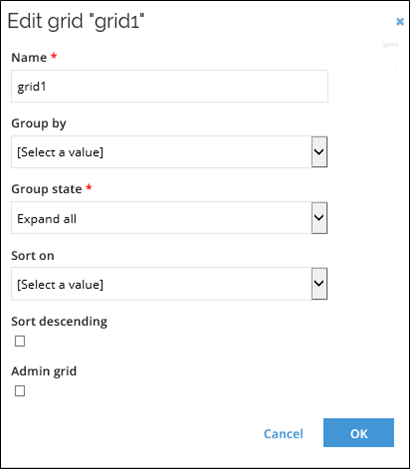
Edit a grid
Follow these steps to edit a grid:
-
Select a grid and click the ellipsis menu next to the Remove button. Click Edit.
-
If needed, edit the name of the grid.
-
In the Group by field, select the property that the grid initially will be grouped by.
-
In the Group state field, select how the grouping is initially displayed:
- Expand all
- Collapse all
- Expand first.
-
In the Sort on field, select the property that the grid initially will be sorted on.
-
Tick the Sort descending checkbox to initially sort in the descending order.
-
Tick the Admin grid checkbox to define this grid as the admin grid.
infoThe sorting settings only represent the grid at its opening. The user can change the grouping and sorting as desired.
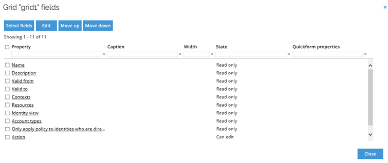
You can also edit the order of the grid:
-
Select the grid and choose Fields from the ellipsis menu on the right-hand side.
-
Click Select fields to add and remove fields through the Add fields dialog. Select the properties you want to show. Deselect those that you do not want to display.
-
Click OK to save your selection. Change the order of the fields by selecting an item and using Move up and Move down buttons.
-
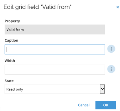
Click any property name to open the Edit grid field dialog.
-
Edit the caption. Caption is the text displayed in the form. It is either a string that will be used instead of the name of the property, or an application string. If empty the display name of the property is used.
-
Edit width of the column by typing in a value in pixels.
-
Edit the state of the field. It may be one of the following:
- Read only
- Editable
- Hidden
- Requires value
infoThe default is Read only.
-
If the field is a reference property, you can define Quickform properties.
noteThe Quickform is displayed when a user clicks a reference property in the grid. The form shows details of the referred object. The Quickform will show the specified properties of the referred object. The properties are read only.
-
Click OK to save changes.
-
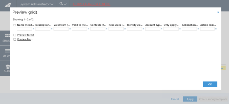
To preview the grid, click the ellipsis menu and select Preview.
Application strings as caption
A grid field can have an optional caption attribute which (if specified) will be displayed as the column header instead of the property name. An application string constant can be stated instead of a literal string (example: S_SURVEY_Text_MyColumnCaption) if multilingual support is needed.
Creating caption in this way requires prior creation of an appropriate application string.
If the specified caption starts with “S_” is it assumed to be an application string.